Skip to Content
News
View All
1
/
16
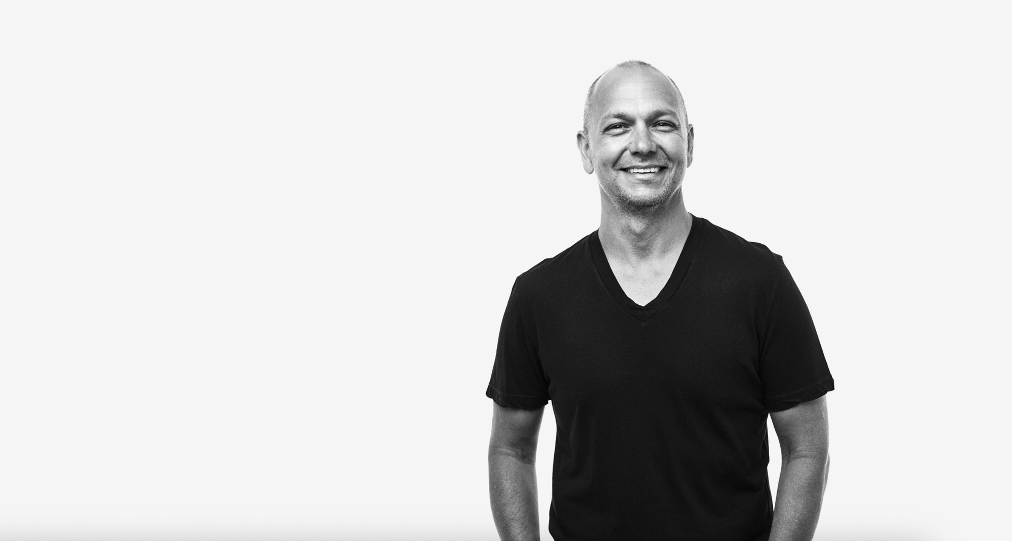
Event Replay—Making What Matters: A Conversation with MAD Designer in Residence, Tony Fadell
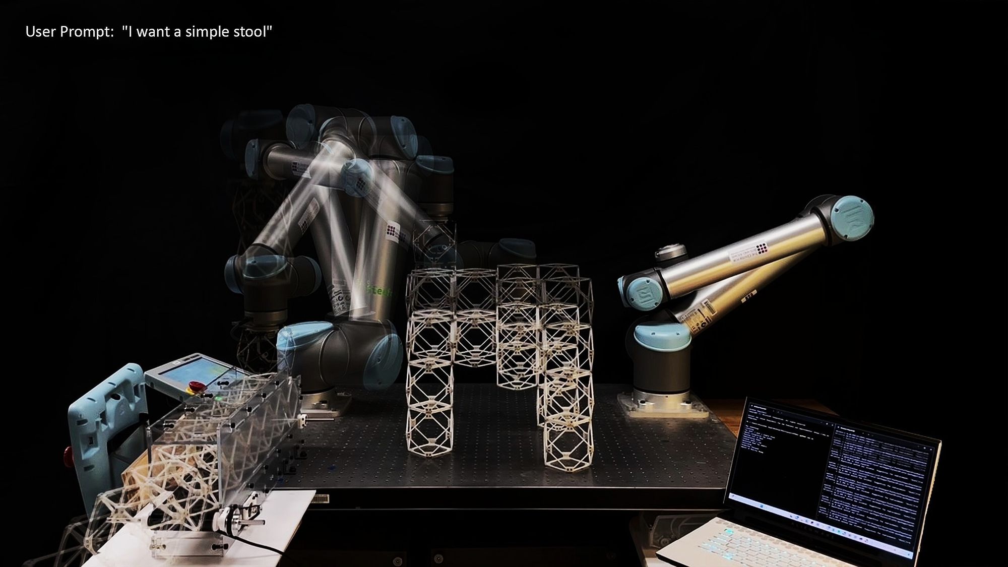
MIT Researchers ‘Speak Objects into Existence’ using AI and Robotics
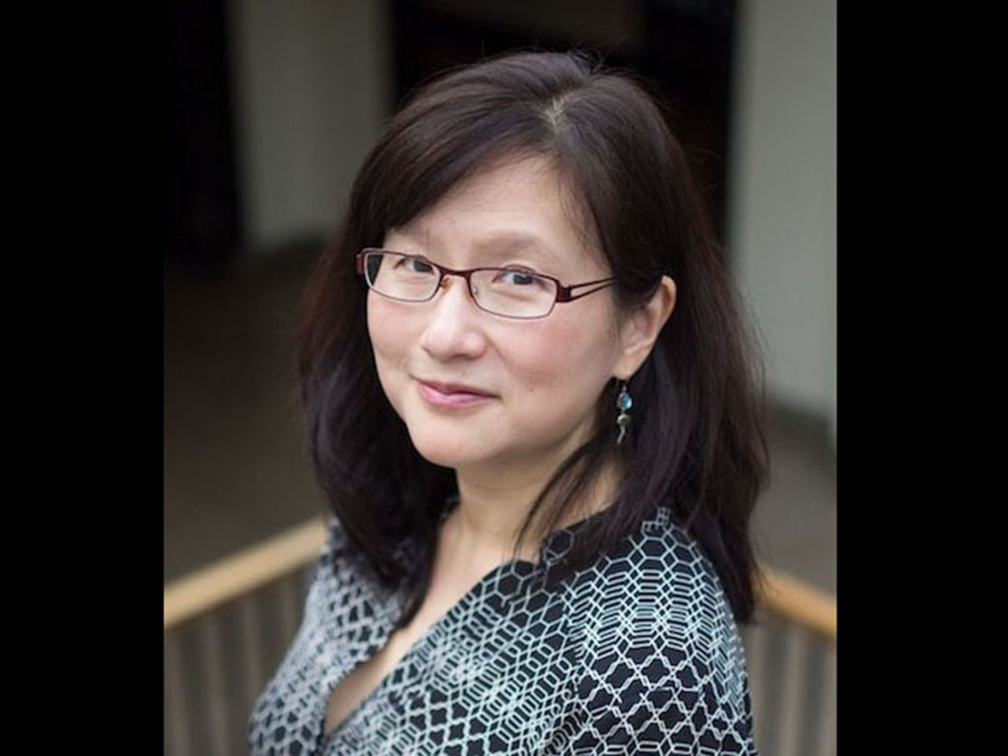
MAD Associate Director Maria C. Yang named Interim Dean of Engineering
Advances in Architectural Geometry Symposium is coming to MIT
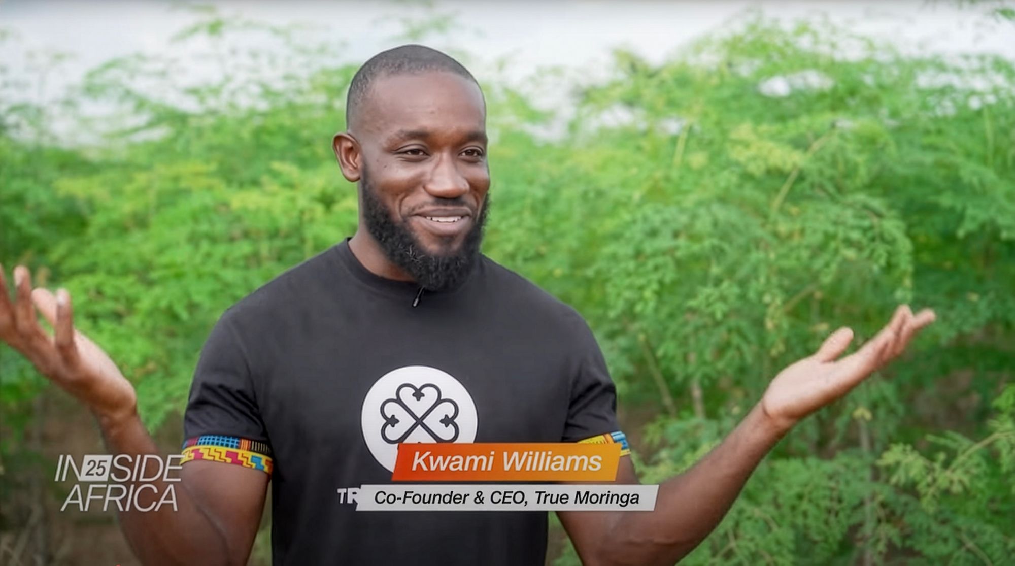
MIT D-Lab spinout True Moringa featured on CNN
iPod Inventor and Nest Founder Tony Fadell Named MAD’s Inaugural Designer in Residence
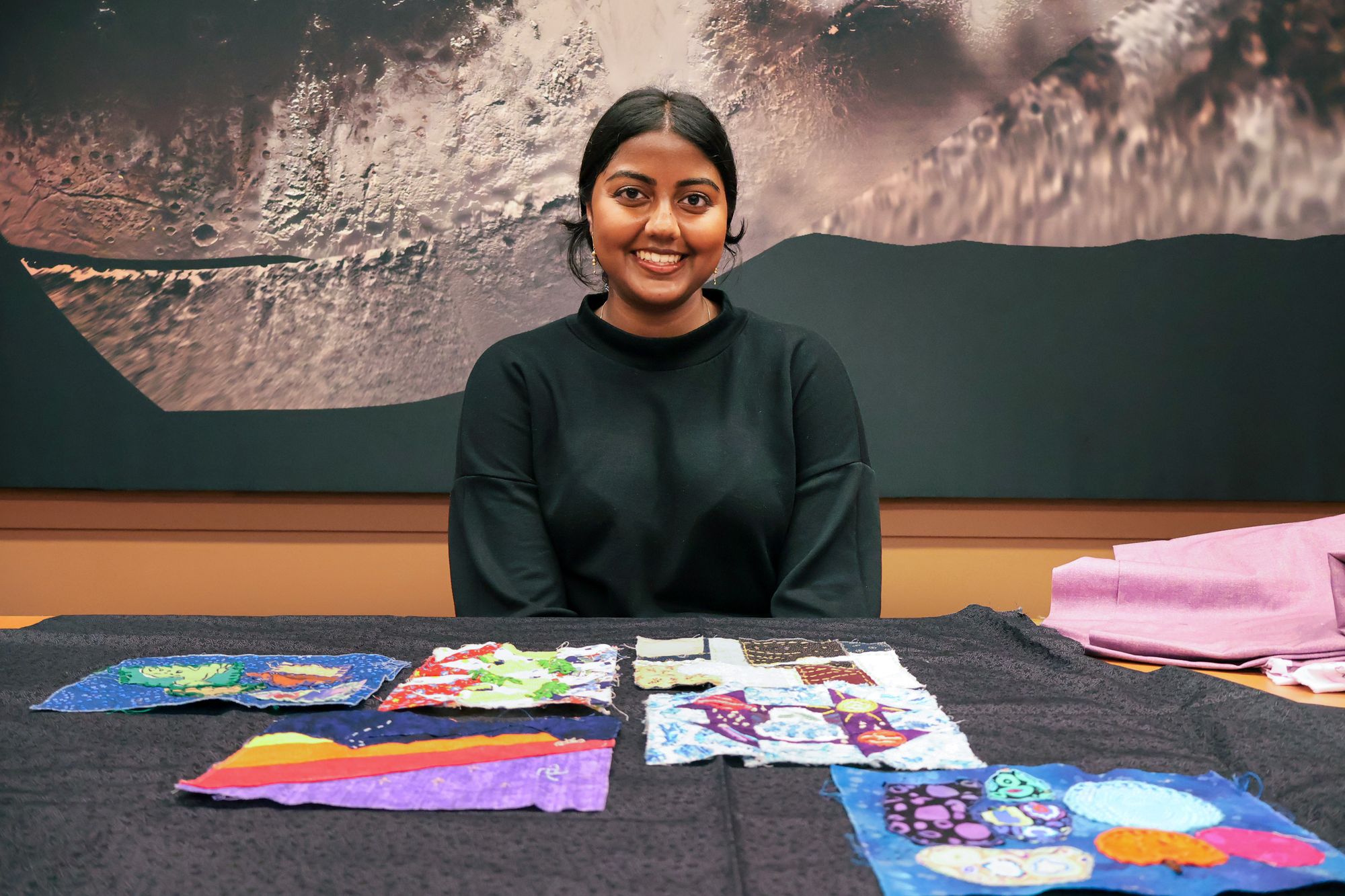
Quilting with astrophysicists
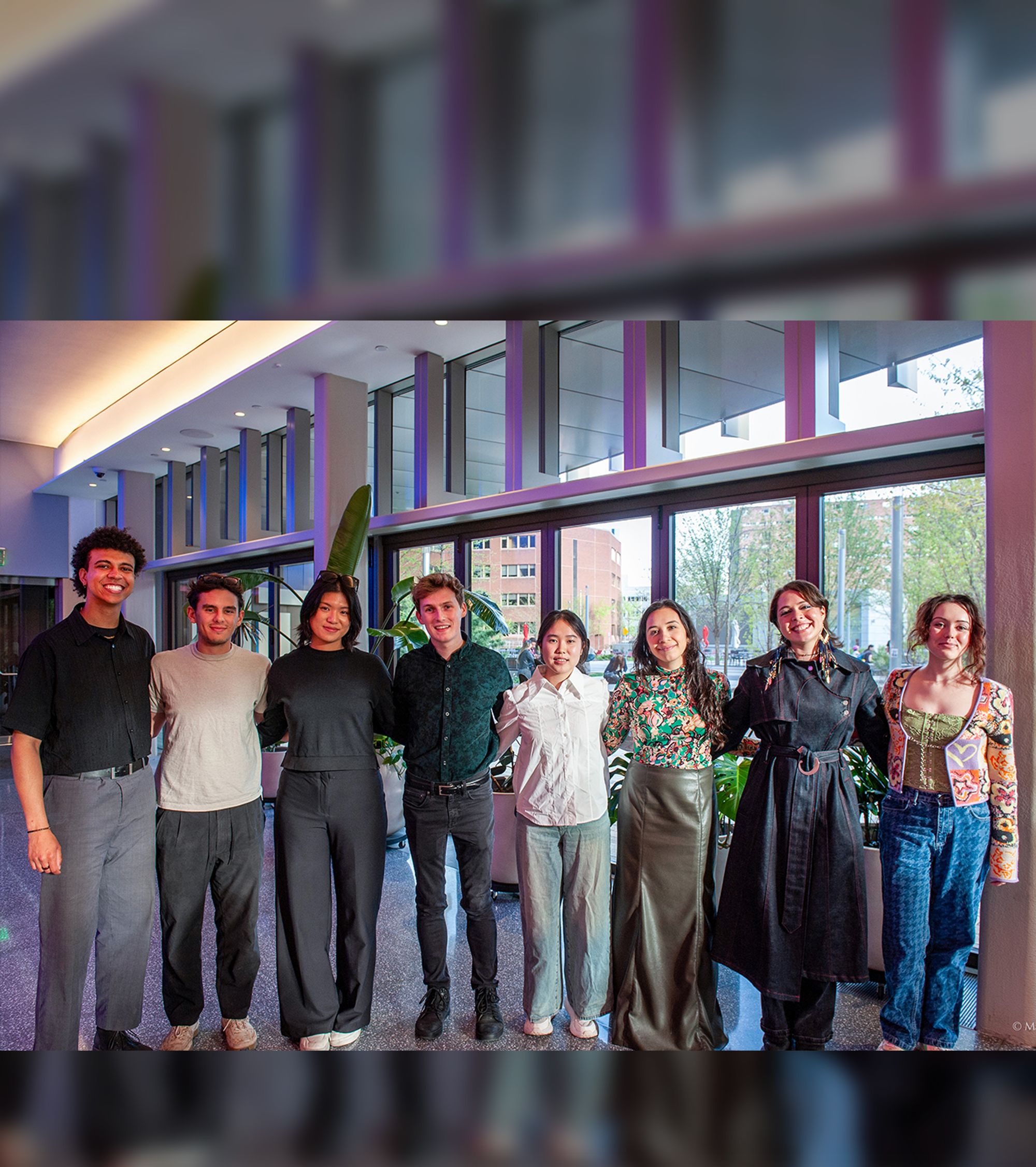
Introducing the 2025 MAD Design Fellows
MAS.S60 Critical Matter: Emotive Design from Fashion to Urban Scale
MIT launches Day of Design to bring hands-on learning to classrooms
Discovering metamaterials with extraordinary energy dissipation
Two initiatives awarded MAD curriculum support to transform design education
Collaborating with the force of nature
Now Open: Fall 2025 Call for Design Events
What does a designer actually do?
Is there a design formula?
Events
View All
1
/
3
Encoding–Decoding Constellations
Dec 10 – Jan 25, 2026
2026 MAD IAP
Jan 5 – Jan 30, 2026
Making Things Worth Making
Jan 30, 2026
Projects
View All
1
/
17
VAMO—Vegetal, Animal, Mineral, Other
Automatic Example Generation for Babylonian Programming to facilitate Human-centric Domain Exploration
Aligning the useful and environmental lifetimes of plastics
The Design of Sustainable Academic Entrepreneurship Ecosystems for AI-Driven Venture Success
Strengthening orthothic and prosthetic care globally
Accessibility of online graphics for blind and low-vision users
Plug-and-Play: Increasing Autonomy in Apartment Living With Flexible Modular Design
Concrete Printed Bridge
AI-Enabled Design of Electroactive Surfaces for Sustainable Cell Culture
Human-AI interaction in generative design
2D Magnetic Material for Sustainable AI
AI-Powered Startup Design for the Anthropocene
AI-Empowered Architect: Connecting Creativity with Efficiency for Sustainable Structures Design
Collaborative Augmented Reality-Guided Mud Formwork for Optimized Structural Construction in Remote Areas
Using AI and Immersive Technologies to Experience the Future Self and Support Sustainable Dietary Choices
Predicting Functional Effects of Genetic Variants
Portable Kitchens
Learning
Undergraduates
Graduate Students
Faculty & Advising
Design Courses at MIT
Day of Design (K–12)
Making
MIT Maker Culture
Labs & Facilities
Research & Innovation
Research
Entrepreneurship
Community
Design Fellows
DesignPlus Advisors
Faculty Advisory Council
Student Advisory Council
Designers in Residence
MIT Design Ecosystem
Team
Resources
Design Library
K-12 Educators
MAD Annual Reports
Applications
MIT Students
K–12 Educators
MIT Faculty
About
MIT MAD
Design Fellowship
DesignPlus Learning Community
Entrepreneurship—MITdesignX
MIT D-Lab
MAD Making
Contact
Room Reservation
Inclusivity &
Accessibility
Sign up for Mad News!
265 Massachusetts Ave
Bldg N52-373, Cambridge, MA 02139
High Contrast
Off
On
Pause Carousel
Making Things Worth Making: From First Principles to Product with Tony Fadell
MIT Researchers ‘Speak Objects into Existence’ using AI and Robotics
Event Replay—Making What Matters: A Conversation with MAD Designer in Residence, Tony Fadell
MAD Associate Director Maria C. Yang: Interim Dean of Engineering
MIT D-Lab spinout True Moringa featured on CNN
iPod Inventor and Nest Founder Tony Fadell Named MAD’s Inaugural Designer in Residence
Graduate student Swati Ravi facilitates collaborative quilt project for Kavli astrophysics community
Introducing the 2025 MAD Design Fellows
1/8
Events
View All
Events
2026 MAD IAP
Jan 5 – Jan 30, 2026
Designing Your Life
Book Club
Jan 20, 2026
Making Things Worth Making
Workshop,
Lecture,
MITdesignX
Jan 30, 2026
Projects
View All
Projects